
More Colour, Please
Colour lessons from two painters, a Mexican market, and my own table

I’ve always loved colour. Anyone who’s been to my house knows that within about four seconds of walking in. My rug is a patchwork of bright colours and my coffee tables are bright orange and yellow. Somehow it all holds together (or so I tell myself).
But loving colour has never been the hard part. The hard part is balance, and how to make it work. There’s a very fine line between a tablescape that feels alive and one that feels like it’s shouting at you. The line between bold and chaotic. And lately I’ve been thinking about that line a lot, because unconsciously I’ve been wanting to cross it more often.
For years, I’ve always had colour on my table, but I’ve always been careful. Two or three colours, and usually matching pieces. There was nothing too loose about the whole setup. I’ve written before about how tablescaping for events gave me permission to be bolder, and I think I’m finally cashing it in. I want my tables to pop. The question is how to do that without the whole thing tipping over.
A Hedgehog, an Octopus, and No Self-Control
In February I went to Mexico, which is a dangerous place if you’re trying to be sensible about colour. Everything is loud, in the best way. But the thing I keep coming back to is the alebrijes.
If you don’t know them by name, you’ve probably seen them. Alebrijes are those fantastical Mexican creatures covered head to tail in patterns and colour. They were dreamed up in Mexico City in the 1930s by an artist named Pedro Linares, who fell ill and hallucinated a forest full of these impossibly colourful animals. When he recovered he started making them, first in papier-mâché, and the form later travelled to Oaxaca where artisans started making them from copal wood.
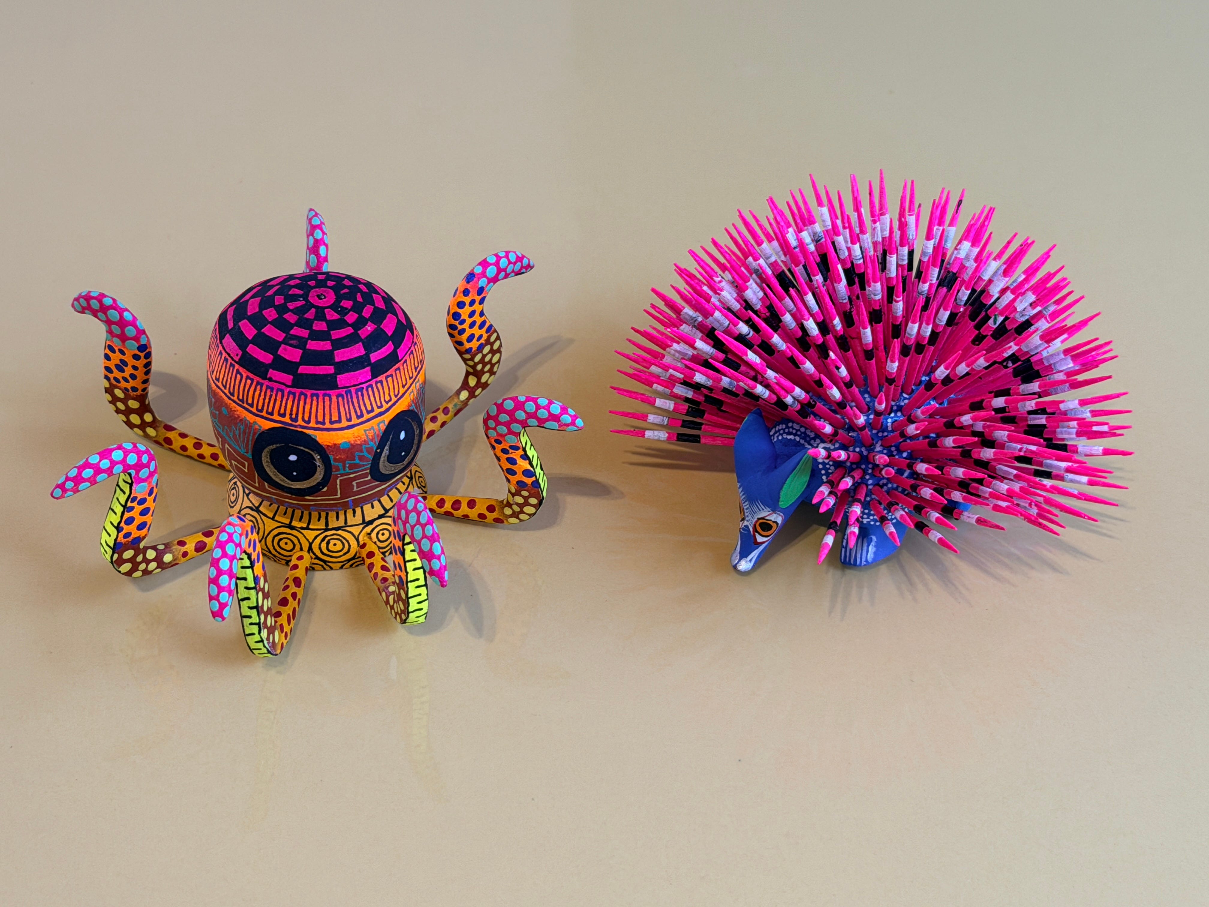
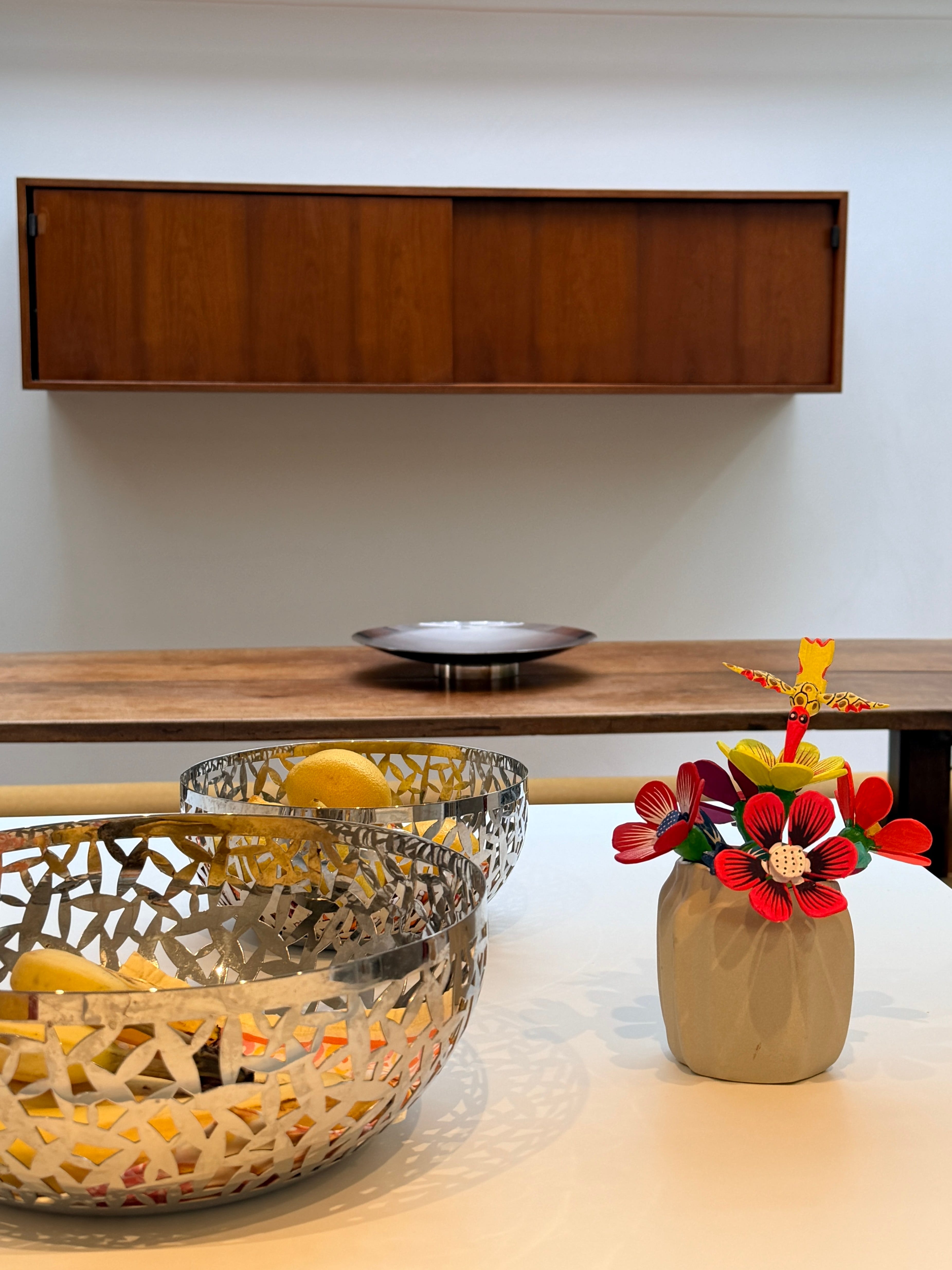
I found them in a market in Mexico City and, if I’m honest, without my sister and her husband I would have bought the whole stall. Luckily (although I still think of some I would have liked to buy), I came back with a significant number, enough to populate my table. The octopus and the hedgehog are the special ones, saved for dinners. There’s also the bird and the flowers which I wanted out all the time, in the kitchen, but standing on its own it felt a bit weird, trying too hard. But when my mother, who was visiting, put it in an old candle, it finally earned its place. Now it sits proudly on the island, exactly where it belongs.
And every time I look at them I think, how does that much colour work? And that’s what sent me down a rabbit hole, as these things do, thinking about artists who spent their whole lives on exactly that question.
Down the Colour Rabbit Hole
The first painter that came to mind was Yves Klein. We’ve all seen that blue. Klein loved colour so much that he trademarked it. International Klein Blue, a deep ultramarine he patented in 1960, because he felt no existing blue did the job. He committed to a single colour completely, and that’s exactly why it stuck. I find that kind of conviction quite something. I looked for tablescapes inspired by Klein blue and couldn’t find any, but he did make a series of coffee tables filled with his pigment, which almost feels like a tease. A Mediterranean table in that blue, someone should do it. I might try one day when I’m confident enough :)
When I was thinking about painters who focused on colours, the other one that came to mind although I did not know his practice well is Josef Albers. Those squares within squares popped in my head. So I decided to dive into it.
Turns out he spent most of his life on a single idea, which he called Homage to the Square. Hundreds of paintings, all the same composition, just different colour combinations. He was trying to prove something simple but quite radical: that colour is never fixed. The same red looks like a different red if it’s next to another colour. Change the background and the colour itself changes.
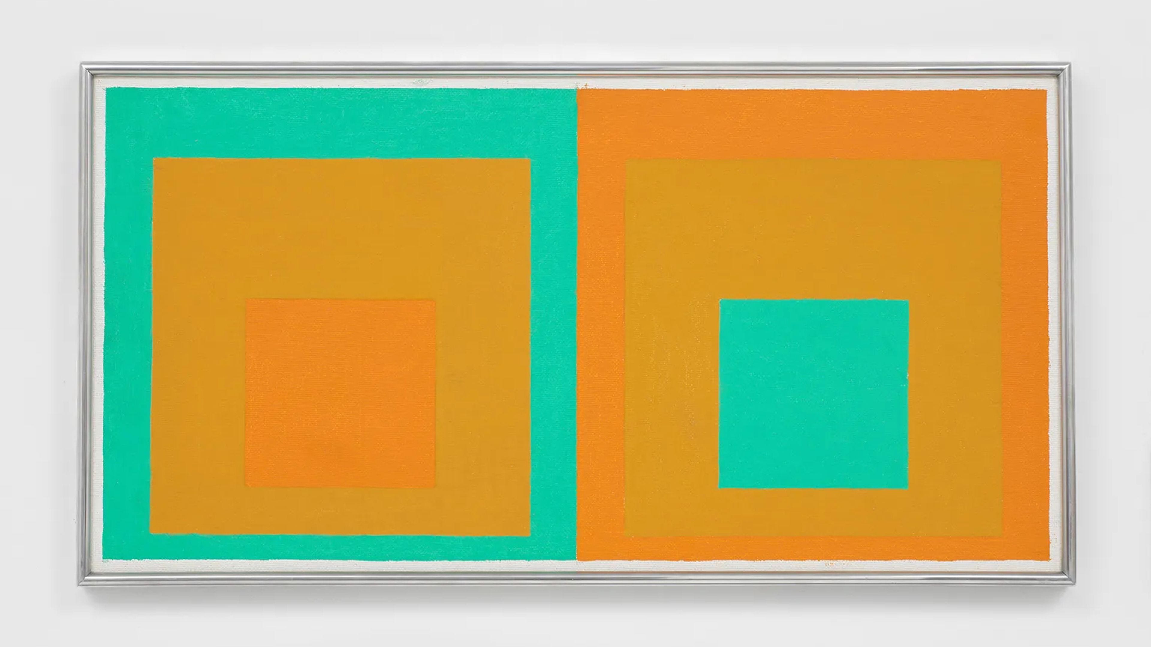
Which, if you think about it, is exactly what’s happening on a table. A terracotta bowl on white linen is one thing. The same bowl on wood is something entirely different. Nothing on a table is ever working alone.
The Danger Zone
I’ve been doing some research lately, for work, on monochrome tablescapes. Tables built around a single colour. I went in slightly sceptical, assuming it would feel too curated or like a styling exercise. It sort of is, but probably the hardest one to pull off.
Because committing to one colour isn’t restraint, it’s the opposite. It is louder than a table done with ten colours. Like the alebrije, a monochrome tablescape is making the same argument, just from the other end: that colour rewards total commitment.
So I don’t think the answer to “how much is too much” is less. I think it’s all the way, one way or the other. The danger zone is the middle, that space where you’re not making a statement, where you’re staying safe.
A Few Colourful Things I Love Right Now
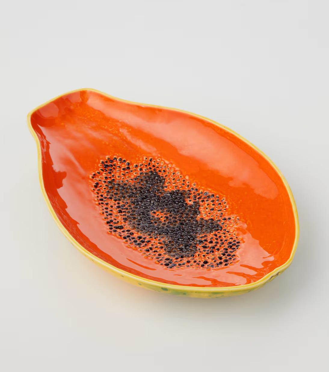
Papaya dish by Bordallo Pinheiro. Or anything by this brand!
Pebble Bowl by Mud Australia. Check their other colours and items. It will be hard to choose!
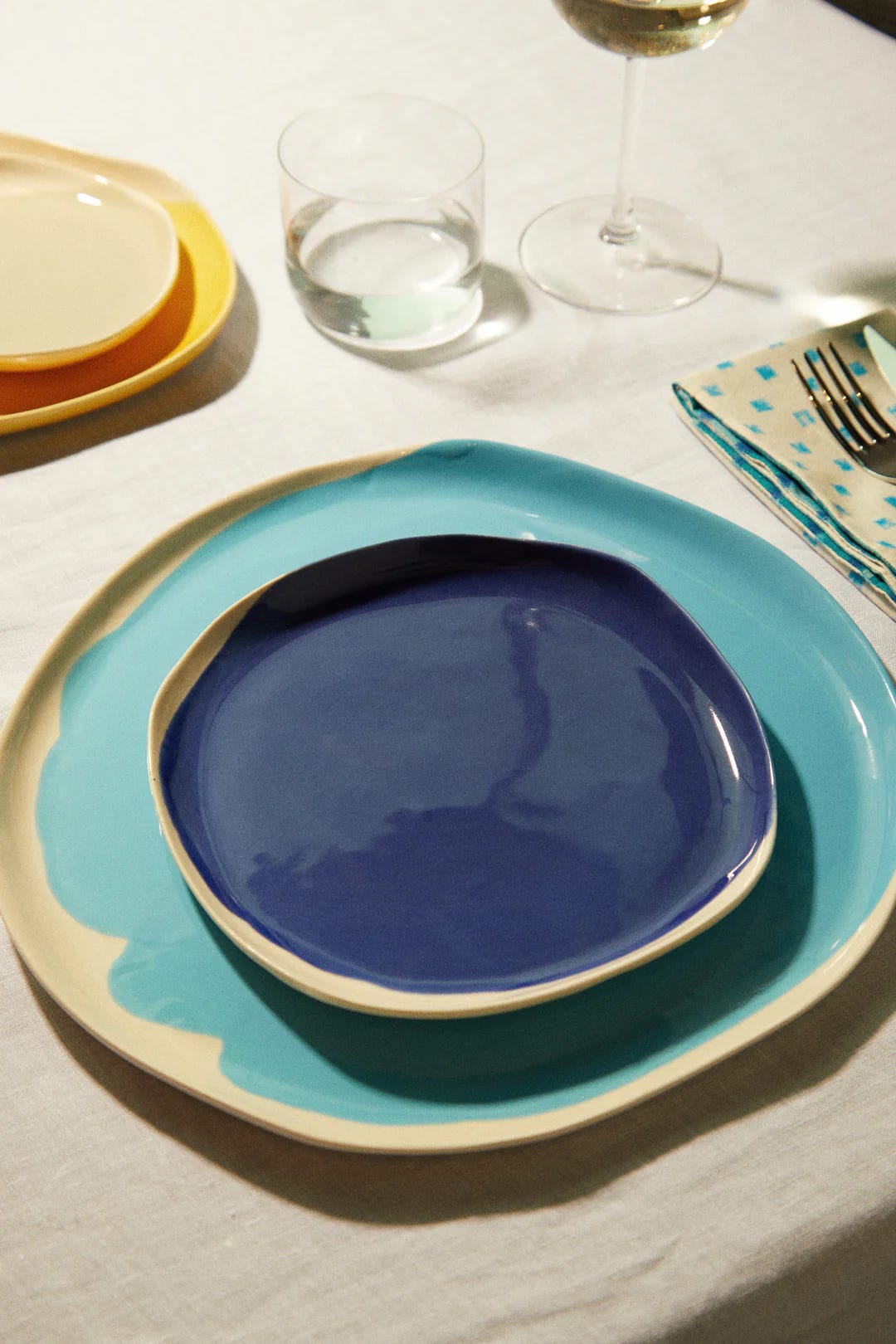
Colour block plates by Pottery & Poetry. Mix & match and see how the colours interact with each other. Like Josef Albers!
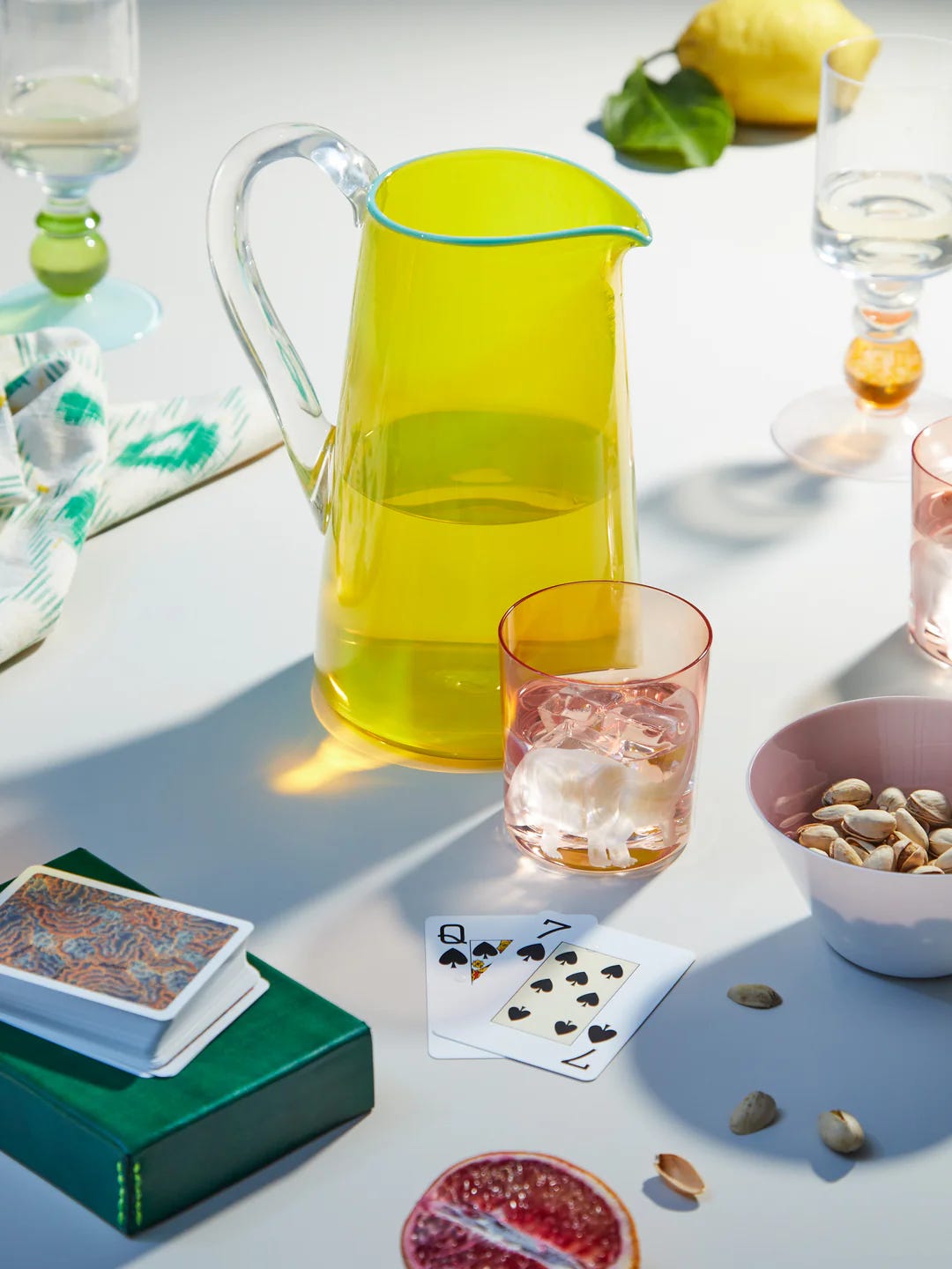
Hand-blown glass jug by Gather.
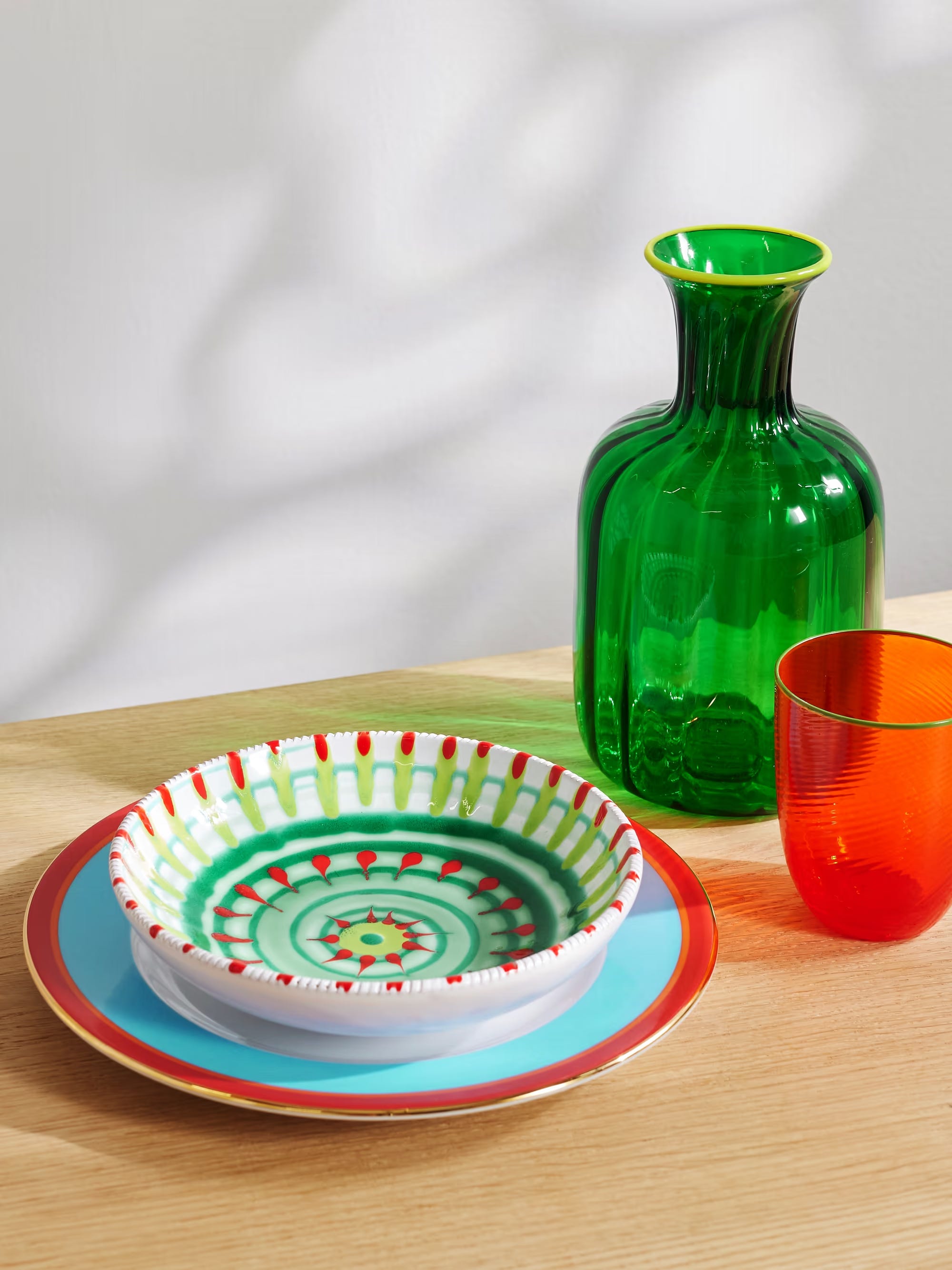
Chilli bowls by Aquazzura Casa.
For now, I’m leaning bolder and the hedgehog approves. Let’s see how bold!
Stay cosy until next time, Jx
If you like this please drop a ❤️ , share it with a friend, leave a comment, or subscribe! For more JOSI, you can follow us on IG.
Come back and buy the rest!!